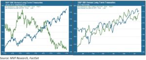
One of the many unusual exhibits on display in today’s asset markets is the seemingly tandem performance of U.S. stocks and bonds through the first half of 2014. Consider the two side-by-side charts below, both showing the price performance of the S&P 500 and the 20+ year Treasury bond. The leftmost chart depicts the trend from January 2012 to December 2013; on the right we see the 2014 year to date pattern.

The left chart is what we normally expect from the relationship between stocks and bonds: one goes up, the other goes down. Treasury yields soared in the first half of 2012 as the world still fretted over the uncertain fate of the Eurozone. In 2013 U.S. large cap equities had their best year since 1997, while bond markets went into a panic over the prospect of the Fed’s winding down its QE program. By contrast, these two asset classes have both enjoyed the investment climes of 1H 2014, causing a great deal of chatter and head-scratching among market participants. Should we expect this trend to continue? If not, which asset is more likely to fall out of favor?
All Quiet on the Correlation Front
As is often the case with short term asset trends there is less here than meets the eye. For one thing, there is not much difference in the correlation between stocks and bonds this year versus long term patterns. The fact of both assets moving in the same general direction this year would imply positive correlation. In fact, the YTD correlation between the two assets shown above, measured by rolling one month returns, is -0.75. That is actually a higher negative correlation than the -0.45 level for the 2012-13 period.
A closer look at the rightmost chart above should explain why this is so. While both stocks and bonds have gained ground this year, they have not done so at the same time. There have been a few classic risk on / risk off trades in the year to date, notably at the end of January when stocks experienced a 5%-plus pullback. There really is not much of a mystery here: stocks and bonds have benefitted from some of the same tailwinds (accommodative Fed, temperate inflation), but also from many independent factors.
Treasuries: Unlikely Yield Oasis
One of the distinct factors driving the bond market is foreign purchases of U.S. Treasuries. According to the Financial Times, foreigners hold a record $5.96 trillion, or just about half of the total volume of outstanding Treasury bills, notes and bonds. This is important: bear in mind that the Fed is reducing its own purchases of long-dated government bonds by $10 billion after each Open Market Committee meeting, taking $50 billion off the table since tapering began last December. Increased bond purchases by non-U.S. investors have thus stabilized bond flows, especially at the longer end of the curve. That helps explain why the U.S. 10-year yield remains far below where it started the year, while shorter term yields like the 2-year note are at or near their YTD highs.
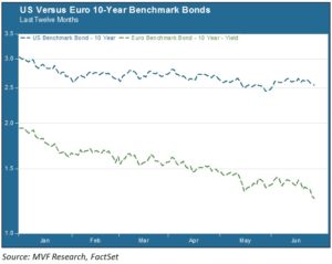
And why are Treasuries so attractive to the rest of the world, given that rates are still far below historic norms? Partly because rates are even lower elsewhere. The chart below shows the yield spread between the U.S. 10-year and the Eurozone 10-year benchmarks.

.5% looks like a good yield when compared to 1.3%. On a risk-adjusted basis Uncle Sam would look even more attractive, given that Eurozone credits share a mix of the stable (Germany) and the shaky (France, Italy et al). In Japan, which shares with China the status of top global Treasuries investor, yields are even lower, and U.S. bonds offer the additional sweetener of a strong currency. The yen is about 17% lower today than it was at the beginning of 2013, thanks to an orchestrated weak currency policy. The Financial Times article cited above notes that the Japanese have bought $33 billion in Treasuries since mid-April – that alone more than makes up for the QE taper.
What’s In the 2H Tea Leaves?
Equities look expensive by historical standards; for example, the price-to-sales (P/S) ratio for the S&P 500 is currently at a ten year high. And credit market watchers are still waiting for what they see as the inevitable rise in rates as the Fed’s likely decision window of late 2015 to early 2016 approaches. It is possible that both asset classes could follow each other on a downward trajectory in the coming months – a reversal of the 1H pattern.
But don’t count on that as a given. For as much as stocks have risen virtually uninterrupted in the past two years, for as many days have gone by without large cap indexes being anywhere near their 200-day moving averages, the market is not yet exhibiting much in the way of final-stage bull rally characteristics. Volatility is tepid, intraday spreads are miniscule, and volume is consistently light. There may yet be another buying wave or two before the end of the year – though another 5%-plus pullback along the way would be far from surprising in our opinion.
On the bond side, we see headline macro data points as the most telling tea leaves. The Personal Consumption Indicator, the Fed’s preferred inflation gauge, clocked in at 1.8% for May. That’s nearing the central bank’s 2% target, and (as we noted in last week’s Market Flash) the Consumer Price Index is already above the 2% watermark. June unemployment numbers will be out in a couple weeks, and as earnings season gets into full swing we’ll see how companies are rebounding from the weather and other headwinds experienced earlier in the year. Stocks up, bonds down? No-one knows for sure, of course, but it may be a reasonable base case.