
MV Weekly Market Flash: 203...

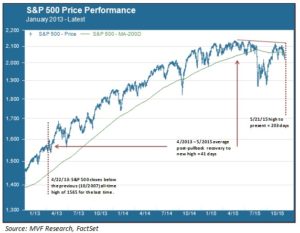
The S&P 500 reached an all-time nominal high water mark of 2130.82 on May 21 of this year. Since then 203 calendar days have elapsed, making this by far the longest post-peak recovery gap in the past three years. The chart below shows the price performance of the benchmark index since 2013. In April of that year the S&P 500 regained the previous all-time high of 1565 set in October 2007. Since then, of course, it has gone on to set successive new all-time highs on a regular basis. As the chart shows, the recovery period following pullbacks from each new high has been relatively brisk. For each pullback of 3 percent or more it has taken about 41 days on average for the index to reclaim the previous record high. That is the context in which the current 203 day gap appears striking. It may simply be a transition to a new, more narrowly selective phase of the bull, as we have argued in recent commentaries. However, we cannot rule out the potential that it could augur something worse.
The Earnings Corridor
The current top-heavy formation of the market started to take shape after a breakout rally in February propelled the index to yet another new high on March 2. The market then entered what we have termed an “earnings corridor”. Roughly speaking, the upper and lower boundaries of this corridor are about 3.5 percent and -1.0 percent respectively from where the S&P 500 began the year. The chart below provides a close-up view of the contours of the earnings corridor and the periodic deviations therefrom.
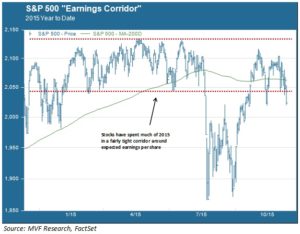
According to FactSet, average earnings per share for companies in the benchmark index are expected to be just about flat this year. The notion that prices would settle into an earnings-bound trading range – after three years of strong expansion rallies from 2012-14 – is to us entirely plausible. It is why we didn’t panic during the August correction. Although never certain, the data at the time suggested a higher likelihood for a return to the earnings corridor than the beginning of something truly awful. While subsequent events have justified that thinking, we do have a greater than average level of concern over what we see as a composite picture of technical weakness. The source of that weakness: failure to establish a new high water mark; testing of support at the lower boundary of the earnings corridor; and repeated breaching of the 200-day moving average support.
Top-Heavy in Rough Seas
To this weak technical picture we must add the contextual variables with the potential to act as catalysts for further downside, with monetary policy divergence and commodity weakness high on that list. OPEC’s Vienna debacle last week has oil prices testing support levels in the mid-30s and setting new post-recession lows. China’s currency is in another funk, and November saw another large net outflow of foreign exchange reserves. The wildly negative reaction of many asset classes to the ECB’s modest policy decisions last week threw a number of trend-dependent hedge strategies for a loop. Much of this week’s volatility may be coming from this space, with funds unwinding or covering positions to deal with the damage incurred last Thursday. A general consensus view of below-trend holiday retail spending is also not helping to impart any holiday cheer.
These rough seas may blow over, particularly once we get past the Fed next week (at this point, a no-action outcome would in our view be far more damaging to market sentiment than the expected 25 basis point rate rise). We have not changed our most likely scenario for 2016 from the “quality rally” we have described in previous commentaries. If a few industry leaders can sustain double-digit earnings growth in an environment where growth is challenged, go there. That is our thinking. But the risk X-factors are out there, and we are not ignoring the potential for them to inflict further mayhem in the weeks ahead.