If you have paid any attention to the daily dose of financial media chatter over the past month or so (and we are of the firm opinion that there are many, many more productive ways to spend one’s time) you have no doubt come into contact with the phrase “flat yield curve.” If the phrase piqued your interest and you listened on, you would have learned that flat yield curves sometimes become inverted yield curves and that these are consistently accurate signals of imminent recession, going back at least to the beginning of the 1980s.
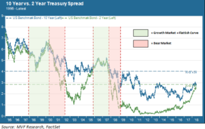
This topic is of particular interest today because the yield curve happens to be relatively flat. As we write this the spread (difference) between the 10-year Treasury yield and the 2-year Treasury yield – a common proxy for the yield curve – is just 0.25 percent. That is much tighter than usual. In fact the last time the yield curve was this flat was in August 2007 – and any financial pundit worth his or her salt will not hesitate to remind you what happened after that. The chart below diagrams the longer-term relationship between 10-year and 2-year Treasury yields going back to 1995.

Before the Fall
In the above chart we focus attention on two previous market cycle turns where a flat or inverted curve was followed by a recession and bear market environment: 2000-02, and 2007-09. It is true that in both these instances a recession followed the flattening of the curve (the red-shaded columns indicate the duration of the equity market drawdown). But it’s also important to pay attention to what happened before things turned south.
Both of these bear market environments were preceded by an extended period of growth during which the yield curve was also relatively flat. These “growth plus flat curve” periods are indicated by the green-shaded columns in the chart. As you can see the late 1990s – from about mid-late 1997 through the 2000 stock market peak – were characterized by very little daylight between the 2- and 10-year yields. The same is true from late 2005 through summer of 2007 (the S&P 500 peaked in October 2007 before starting its long day’s journey into night).
You Can Go Your Own Way
In both of those prior cases, in other words, a flattening yield curve wasn’t a signal of very much at all, and investors who took the cue to jump ship as soon as the spread went horizontal missed out on a considerable amount of equity market growth. In fact, the dynamic of “flat curve plus growth,” far from being unusual, is not unexpected. It has to do with what the respective movements of short term and long term yields tend to tell us about what’s going on in the world.
Short term rates are a much more accurate gauge of monetary policy than yields with more distant maturities. If bond investors anticipate an upcoming round of monetary tightening by the Fed, they will tend to move out of short-term fixed rate securities, sending yields on those securities higher. When does monetary policy normally turn tighter? When growth is heating up, of course – so it should be no surprise that short term rates will start trending up well before the growth cycle actually peaks.
Longer term yields, on the other hand, are much less predictable and tend to go their own way based on a variety of factors. For example, in that 2005-07 period when short term rates were trending up, the 10-year yield stayed relatively flat. Why? Because this period coincided with the height of China’s “supercycle” during which Beijing routinely bought gobs of Treasury bonds with its export earnings, building a massive war chest of dollar-denominated foreign exchange reserves.
To Every Cycle Its Own Story
At the same time, many other central banks were building up their FX reserves so as to not repeat the problems they experienced in the various currency crises of the late 1990s. Yes – the late 1990s, when economies from southeast Asia to the former Soviet Union to Latin America ran into liquidity difficulties and injected a massive amount of volatility into world markets. Global investors responded to the volatility by seeking out safe haven assets like – surprise! – longer-dated US Treasury bonds. Which partly explains why the yield curve was so flat from ’97 through the 2000 market peak.
So yes – at some point it is likelier than not that we will see another flat-to-inverted yield curve lead into another recession. Meanwhile, the dynamics driving longer-term bond issues today are not the same as the ones at play in the mid 2000s or the late 1990s. Maybe spreads will widen if a stronger than expected inflationary trend takes root. Maybe the 10-year yield will fall further if US assets are perceived to be the safest port in a global trade war storm. The important point for today, in our opinion, is that there is a resounding absence of data suggesting that this next recession is right around the corner. We believe there is a better chance than not for some more green shading on that chart between now and the next sustained downturn.