“The market was up (or down) today,” says the financial news anchor. Almost invariably that comment will be followed by the daily performance numbers for the Dow Jones Industrial Average, and maybe also the S&P 500 and/or the NASDAQ Composite Index. Those three have become a kind of holy trinity of U.S. stock market benchmarks – a tangible shorthand for “the market”. In fact, though, these three benchmarks are very different from one another, with different performance dynamics. In reality, none of them constitute “the market” in its entirety, but rather each offers a partial view of that market. Consider the following chart:

Several Markets, Not One
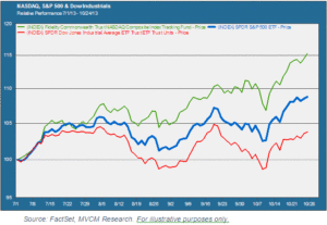
This chart shows the relative performance of the NASDAQ Composite (green), the S&P 500 (blue), and the DJIA (red) from the beginning of July to the present. As you can see, performance has widely diverged between the three. The NASDAQ Composite appreciated by 14.9% over this period. The S&P 500 clocked in with a 9.2% price advance, while the Dow put up a significantly more modest 4.3% gain. We represent all three exposures by exchange traded funds that track the respective indexes.
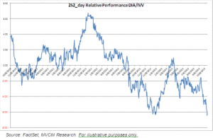
This particular time period does not represent some kind of anomaly. Consider the following chart, which shows the relative performance of the S&P 500 and the Dow over the past three years. Again, both are represented by ETFs (IVV and DIA) that track the respective indexes. When the line is above the horizontal axis, it indicates outperformance by the Dow over the S&P 500, and vice versa when the line is below the horizontal axis.

The Dow is currently in a period of sharp underperformance versus the S&P 500, but back in late 2011 and early 2012 it was outperforming by roughly the same amount (about 6% on a one-year basis). When you think about it, this should really not come as a surprise. The Dow Jones Industrial Average is an index of 30 very large, blue-chip companies, and its components are weighted by price. The S&P 500 includes 500 large and large-to-mid cap companies, and is weighted by the market cap contribution of each member. That’s enough difference for us to expect that these performance differences should be the norm, not the exception.
The Limits of Benchmarks
The real message here, though, is that there are limits to the effectiveness of market benchmarks as a way to measure investment performance. Benchmarks can serve as a useful data point, by putting a context around performance in a given period. It is all too easy, though, to get hung up on a single benchmark as the ultimate performance arbiter. As these charts demonstrate, this is a flawed approach. If a manager of large cap U.S. stocks were to choose the Dow as a benchmark for the July-October 2013 period, she would have a much lower bar to clear than she would by using the S&P 500. Likewise a growth stock manager who invests in companies that tend to show up on the NASDAQ Composite would probably rather use the S&P 500 than the NASDAQ as a benchmark when the latter has performed so well. Benchmarking is by nature arbitrary and subject to misleading interpretation if relied on excessively.
Multi-Factor Performance
Portfolio performance depends on a combination of factors, not just returns-based performance against one benchmark or another. Risk is a critically important factor – both absolute risk and risk relative to the market. Other factors include performance during drawdown periods, fidelity to a professed investment style, and correlations between different assets in a portfolio. In this multi-factor performance methodology, there is certainly a role for market benchmarks. But that should not be to the exclusion of other important factors.