Last month, White House press secretary Sean Spicer instructed us that the 235,000 payroll gains recorded for the month of February were a direct and unambiguous consequence of the “surge in economic confidence and optimism that has been inspired since [Donald J. Trump’s] election.” This month it would appear we are back to “fake” job numbers, as the latest batch of data from the Bureau of Labor Statistics not only revised last month’s figure down by 16,000 souls, but the March total of 98,000 came in well below analysts’ expectations of 180,000 new hires.
Equally silly are attempts on the one hand to take credit for one single month’s data point, and on the other hand to point to that of another month as a harbinger of failure (or fake, for that matter). A wave of statistical fluctuation – otherwise known as the “margin of error” – accompanies all economic data releases and means that the variation between what actually happened and what the number shows can be wide indeed. There is no reason to expect that the overall labor market picture is either better off or worse off when considering the two data points from this month and last. More importantly, though, the popular obsession with “The Number,” as the monthly payroll gains figure has come to be known – says little about the real state of affairs in the world of employment.
Who’s In, Who’s Out?
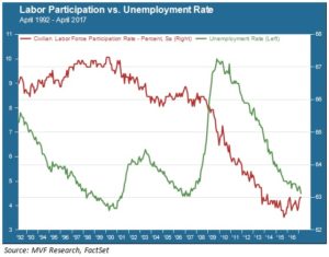
What’s the “natural” rate of unemployment? This is a term economists use to try and define what employment would look like in a theoretically stable economy, i.e. in some sort of harmonious equilibrium between jobs, wages and consumer prices. While nobody can pin down exactly what this rate would be in the messier economy of the real world, chances are that the current unemployment rate of 4.5 percent is not all that far away. The chart below shows the unemployment rate trend over the past 25 years, along with the labor force participation rate, another useful employment metric that adds an important perspective to the longer term structural picture.

The 4.5 percent figure in today’s BLS release is the lowest since the middle of 2007, and the above chart clearly illustrates (green line, left y-axis) the dramatic improvement in overall employment since the 2008 recession. But astute observers will notice something odd about the recent trend. When the unemployment rate skyrocketed during the Great Recession, the labor force participation rate (red line, right y-axis) started to fall sharply. But the participation rate kept falling steadily even as employment perked up, and is still more or less directionless even in the current favorable environment. How should we interpret this trend? In other words, who’s out of the labor market forever, and who’s potentially back in if sufficiently enticed (e.g. by better wages, benefits etc.)?
Back to Work, or Off to the Links
The labor force participation rate reflects several important structural trends. One, of course, is the natural increase in the number of retirees as baby boomers activate their retirement accounts and head off for 18 holes or catamaran vacations or whatever. That this rate has fallen from its peak at the end of the 1990s is not surprising, as the first cohort of boomers hit their sixties shortly thereafter. But the accelerated drop in participation from 2008 obviously includes as well the millions of jobs lost from the recession. The absence of a clear reversal in this trend would seem to indicate that, despite the steady pace of new job creation since 2010 – the longest uninterrupted streak of monthly net payroll gains since the BLS started keeping track of this – a meaningful percentage of those jobs lost during the last decade remain unaccounted for. This is true even when you strip out the retiree cohort on one side and young full-time students on the other. The employment-to-population ratio for the cohort aged 25 to 54 – peak working ages – also remains well below its peak reached in 2000.
Wages and Prices
These structural metrics matter, because an increase in the percentage of working Americans to the total population is one way an economy grows. For that red line in the above chart to become a reliable uptrend probably depends mostly on how much more upside there is in real wage growth. Average hourly earnings grew this past month in line with the recent trend level of about 2.7 percent year-on-year. That’s still higher than monthly consumer inflation, but recent strength in the CPI has narrowed the gap. Real purchasing power increases will continue to depend on wage growth outpacing price growth.
Much of the chatter in financial markets recently has been about the notion that the same animal spirits gripping investors of late will motivate business owners and management teams to sweeten the pot and attract scores of new hires, in anticipation of some wonderful new era of growth. Every month we get a new read from the BLS on the state of things (with the statistical variabilities mentioned above), and each data point gives us another piece of a giant and complex puzzle. What we do know is that none of the measures of long term growth – not the rate of population growth, not the percentage of the population actively in the labor force, and not the productivity rate –validate the assumptions behind those animal spirits. Until they do, we must remain skeptical. And see what goodies next month brings.