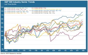
Usually when we append a chart to one of our commentaries, the aim is to shed light on a particular trend. Sometimes, though, the trend in question is actually the lack of a trend, and such is the case this week. Behold the chart below and call up your metaphor of choice: a plate of spaghetti (that multicolored kind with beet, spinach, squid ink etc.), a few tangled skeins of knitting yarn, an attempt at abstract art by a hung-over wannabee Picasso.

Up, Down, All Around
What to make of that tangled web? Healthcare has performed rather well, for no particular reason. Energy has fared poorly of late, despite oil prices near their best levels of the year, just off $80. Otherwise it’s up one day, down the next. Information technology, which has been the main driver of the market’s performance for the better part of the last 18 months, is actually trailing the benchmark index in the most recent three month period.
It’s as if Ms. Market wakes up every morning and flips a coin – heads for risk-on, tails for risk-off. There’s no discernable leadership theme. Remember the “value rotation that wasn’t” about which we wrote earlier in the summer? The forensic evidence is there – note the sharp drawdown in the blue line (representing technology) around the 7/30 time period, which then bounced back up almost immediately. There was no value rotation then, nor in the immediate period after Labor Day when tech fell again while defensive favorites like consumer staples and utilities jumped.
Nowhere Else to Go
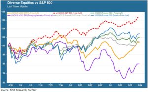
What happens in the S&P 500 is increasingly important, because there are few other refuges for risk-on portfolios. For much of this year we had a strong leadership trend in domestic small cap stocks. The Russell 2000 small cap index is still ahead of the S&P 500 year to date, but the outperformance trend ran out of steam a couple months back, as the chart below shows.

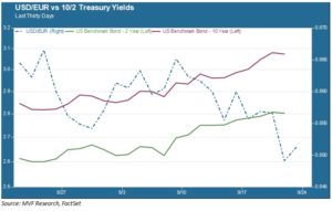
We do see something of an uptrend in non-US stocks over the past couple weeks, but there are reasons for not being too excited about an imminent mean reversion of any meaningful duration here. Most of the juice in the MSCI EAFE (gold) and Emerging Markets (purple) in this recent trend is coming from a weaker dollar versus other currencies. That in itself is counterintuitive. US interest rates have been rising, with the 10-year Treasury now comfortably over 3 percent and the 2-year steadily continuing its ascent ahead of an expected rate hike when the Federal Open Market Committee meets next week. Higher interest rates are normally a bullish signal for the home currency, attracting investment income from abroad. But no – the dollar has confounded rational investors by retreating while interest rates rise. We illustrate this in the chart below.

Going back to that first chart with the chaotic sector spaghetti, we can be thankful that the overall directional trend of US large cap stocks remains resolutely upwards. Who cares what’s ahead and what’s behind, as long as everything more or less moves in the same positive direction – right? And to be clear, the broader story remains largely the same. Good job numbers, good growth, strong corporate sales and earnings – the narrative, like The Dude Lebowski, abides. But at some point one wants to see that tangle of price trends turn into a clearer picture with a rational supporting narrative. Is it finally time for value investors to come into the sunshine? Could a value trend sustain the bull market for another cycle before it gives up the ghost? Or is this just a phase of directionlessness before the tech giants reassert themselves for yet another gravity-defying cycle of outperformance? Stay tuned. And happy autumnal equinox!