We’ve sort of gotten into the habit of referring to the 2018 equity market pullback in the past tense, which is not technically correct as the S&P 500 still languishes around 7 percent below its late-January record high. But the sense of drama that accompanied those big plunges in February in March, alongside the breathless narrative of a global trade war, is no longer clear and present. Is it too early to do a post-mortem and contemplate what may lie ahead? That’s entirely possible – whatever the market decides to do on May Day and the rest of next week is as murky as always. Nonetheless, we have our forensic tools out and will do a little dissecting of the present state of things. As volatile as things have been, this has so far been a remarkably well-behaved little correction.
Highly Relevant Nonsense
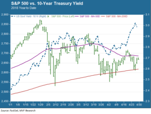
Perhaps nowhere is this well-tempered aspect more visible than in the market’s price performance vis a vis its technical moving averages, particularly the 50-day and 200-day averages. Now, we have made the point before and we will make it again: there is nothing magical or transcendental about moving averages. They are just methodical calculations. But they are given relevance because short-term trading strategies make them relevant – another example of the “observation affects reality” phenomenon we have described in other recent commentaries. The chart below shows the year-to-date performance of the S&P 500 along with the 50- and 200-day averages, and also the yield on the 10-year Treasury (which we will discuss in further detail below).

The 200-day moving average often serves as a support level. Technical traders get worried when the market breaches this downside support and fails to reestablish a position above it. No such worries this time: the index breached the 200-day average a handful of times in intraday trading but only closed once below it. Enough of those algo strategies were wired to kick in at this level, and there wasn’t enough prevailing negative sentiment to push prices into further negative territory. This played out most recently during this past week.
Our takeaway message from this is more or less what we’ve been saying throughout this period; namely that the catalyzing X-factors of this pullback – first the inflation fears after the February jobs report and then the new US tariffs – weren’t convincing enough to detract from the background narrative of continuing global growth and healthy corporate earnings.
On the other hand, though, the S&P 500 has had a similarly hard time staying above the resistance level of the 50-day moving average. Sentiment then, while not bearish, is also not wildly bullish. Investors wanting to see a clear “W” shape emerging from the pullback may have to bide their time for a while longer, or at least until the momentum strategy funds that got burned in February have worked through all their pain trades and those moving averages become less relevant to the daily flow of things.
Stocks and Bonds: Not Quite a Pas de Deux
Another observation that’s done a few laps on the financial pundit circuit recently is the idea that stock prices and bond yields have been moving in the same direction for much of the year. Well, sort of. In the aggregate that observation is clearly not true: stock prices are struggling to break even for the year to date, while the 10-year Treasury yield is up sharply from where it was in early January. But the chart above does show some degree of correlation during different sub-periods, most especially in the first three weeks of January when they did seem to move almost in tandem. Yields also reverted to traditional safe haven behavior during the second (trade war) prong of the pullback in mid-late March.
The correlation pattern diverged more prominently during the S&P 500’s mini-retreat of late last week and the first half of this week. The 10-year yield spiked to puncture the 3 percent level for the first time since 2014. Meanwhile, stocks fell back as investors, digesting a healthy stream of corporate earnings, did their best impression of a bratty kid who didn’t get the exact Christmas present he was expecting. “Peak quarter” seems to be the phrase of the day: the idea that this is about as good as it will get, even though the hard evidence for that glass half empty conclusion appears sparse.
What’s the overall takeaway? There’s a whiff of 2015 in the air. In that year stock prices set a record high in May and didn’t break new high ground until June of the following year (ironically, in the immediate aftermath of the Brexit vote, go figure). Cautious sentiment – neither pessimistic nor optimistic – may keep share prices in a sideways pattern. Those silly moving averages may continue to restrain directional breakouts. This kind of environment often suggests a return to quality, where things like free cash flow and debt ratios actually matter again and careful stock selection can pay off.
Then again, none of that could be true. If there’s anything one learns over the days and years in this profession, it is to always expect the unexpected.