
MV Weekly Market Flash: Volatility:...

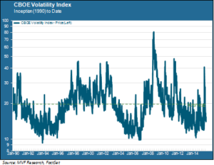
Since its inception in 1990 the CBOE VIX index – the so-called “fear gauge” – has shown itself to be a fairly good barometer of market risk. The index’s mean reversion tendency is particularly useful; the long term average value of 20 (shown as the dotted green line in the chart below) fairly neatly separates lower risk and higher risk environments. A value of 20 or higher signals a relatively high perception of risk, while extended periods below that threshold generally suggest benign conditions for equities. In view of the recent market correction and (partial) recovery, what can the VIX tell us about where we may be headed as 2016 approaches?
The Peaks
Let’s start with the most dramatic – and most often misused – feature of the VIX, namely those periodic Andean peaks spiking into the stratosphere. A VIX peak over 20 will typically be accompanied by a stock market pullback of several percent or more. More often than not, though, the risk reflected in that pullback is short-term and event-driven, rather than a signal of a more sustained bear market environment. Consider October 2014. The VIX had been sleepy for most of the summer and early fall, hovering in the low-mid teens as October got under way. A confluence of several events – among them falling oil prices, a weird “flash crash” in Treasury yields and an inchoate panic over reports of an Ebola outbreak in Sierra Leone – managed to rouse the trading bot armies into sell mode. The VIX spiked to 26 and the S&P 500 gave up close to eight percent. Then, as quickly as it appeared, the risk vanished, leaving a great many hedge strategies much the worse for wear.
The Valleys
In analyzing the VIX we care more about the baseline trend than the peaks. The above chart shows three distinct, sustained periods of relatively low volatility to which we refer as “valleys”: mid-decade in the 1990s and 2000s, and the better part of the past four years. Not surprisingly, all three valleys have coincided with favorable tailwinds for stocks. However, the baseline in the most recent valley is somewhat higher than that for the previous two. The average VIX level from 2012 to the present is about 15.6, compared to 13.7 for the 2004-06 period and 13.8 from 1993-96. While part of this difference is explained by a handful of higher peaks (notably those associated with the pullbacks of 2014 and 2015), there have also been – as clearly seen in the chart – fewer “tween” days (where the VIX closed between 10 and 12). This has been a somewhat jittery recovery despite the strong gains.
The Mesas
This brings us to the VIX characteristic we regard as most instructive: the mesa formations. On the above chart these are the two examples of the VIX maintaining a baseline level of 20 or higher for a sustained period of time. The two mesa environments since 1990 have both coincided with bear markets, but the more salient fact is that both mesas formed well before the bear took shape. During the 1990s bull market, the VIX was setting regular baseline closes above 20 from the middle of 1997 on. Practically the entire final phase of that great bull took place in an elevated risk environment. In a somewhat similar vein, the VIX was already in a mesa formation by the time the S&P 500 set its final pre-crash record high in October 2007.
A VIX mesa is not by itself a sell signal. Clearly, it would have been a poor strategy to sell out of the market between 1997 and 1999. Any technical signal needs to be considered in the context of other signals, and only when enough of them are flashing does it make sense to execute a defensive position. We do not see a sufficient number of flashing signals today to suggest putting up the ramparts. But we are watching the VIX trend. A mesa formation is a plausible scenario for 2016, even if the bear is (as we imagine) still some ways away. It would be consistent with both a narrow rally led by a few high quality performers, which is our base case scenario, as well as a “melt-up” reminiscent of 1999. Time will tell.