In our annual market outlook back in January (wait, is it already Memorial Day weekend?!) we had two principal things to say about volatility. First, that we expected to see a higher level of volatility as one of the key defining characteristics of risk asset markets in 2019; second, that volatility is not always associated with downward trends in asset prices (meaning that higher volatility could be present in both up markets and down markets). How has that prognostication played out so far this year? As we head into the summer season it seems a good time to revisit our January musings.
Peaks, Valleys and Mesas
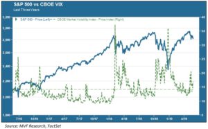
Those of you familiar with how we have described volatility in the past will have encountered our topological renditions of the VIX index of market volatility, commonly known as the market’s “fear gauge.” Briefly, we have intermittent peaks when risk levels suddenly spike into the heavens like so many Gothic spires, and we have calm undulating valleys when investor attitudes are serene. And then we have mesas – extended periods where volatility is elevated but not as dramatic as those short spikes. The chart below provides a full rendering of this VIX topography over the market cycle of the past three years. In this chart the VIX is represented by the dotted green trendline, while the solid blue line shows the price trend movement for the S&P 500.

The peaks are pretty straightforward: they tend to happen when equity prices go into a tailspin. The most prominent risk spikes over the past three years, unsurprisingly, coincided with the sudden correction in stock prices in February 2018 and again in fall-winter of the same year. Those earlier, smaller spikes you see in 2016 coincided with the Brexit vote and the run-up to the US presidential election in the same year. Of course, in the aftermath of that election and throughout most of the following year investor sentiment was for the most part calm, and we experienced a long volatility valley that wound up setting successive new lows for the VIX throughout the summer and fall of 2017.
The mesas – that third topological element – figures into the interim period between the market correction spikes of February and October-December 2018, and again in the period since. Here we circle back to those comments about volatility we made in our January annual outlook. Higher volatility has indeed been a characteristic of asset markets this year, even though the overall price trend for most asset classes has been resoundingly positive. You can see that the VIX mesa between January and May 2019 is somewhat more elevated than that of April – September 2018, with more time spent above the long term average of 14.22 for this entire three year period. We think this is consistent with the contextual themes we discussed in our outlook: expectations for slower growth and a tougher set of comps for corporate earnings and margins, along with continued uncertainty about global trade. The mesa probably would have been higher still had not the Fed turned abruptly on its monetary policy towards a more dovish stance, with no more rate hikes in the foreseeable future.
Wider Intraday Spreads
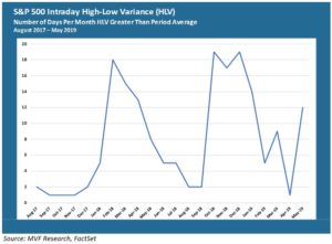
The VIX, of course, is not the only way to look at risk and at times it can be misleading. VIX contracts are traded, bought and sold like any other asset, and as such what the index may be telling you on any given day can have more to do with flighty investor sentiment than with the underlying risk properties of the assets themselves. One such risk property is the intraday spread – the magnitude of difference between a stock’s intraday high and low price, expressed as a percentage of the closing price. In the chart below we show the intraday trend for the S&P 500 between August 2017 and the present.

Here’s how to interpret this chart: it shows the number of trading days each month for which the day’s intraday high-low variance (HLV) was greater than the average HLV for the entire period. For the entire period measured, the average HLV was 0.89 percent, meaning that the price difference between the high and the low was 0.89 percent of the closing price. So for any given day, if the HLV was higher than 0.89 percent that day was counted in that month’s tally. For example, in each of the months of September, October and November 2017, there was only one day in which the high-low variance was higher than the period average. By contrast, in both October and December 2018 the daily HLV was higher than average for nineteen days (in other words, for practically the entire month).
How does this chart help us understand the current risk environment? Well, the average number of higher HLV days for the first five months of this year (through the 5/23 close) is 8.2, including double-digit HLV days in both January and May. Again we want to make the point that volatility can be elevated even when the market is going up – January 2019 saw one of the strongest monthly price gains on record for the S&P 500, but there was higher than average intraday volatility for fourteen out of twenty-one total trading days. Conversely, the twelve HLV days recorded thus far for May coincide with a more risk-off mentality for investors as they pulled back in the wake of new record highs in April.
We believe there continues to be good reason to expect higher volatility in the weeks ahead. Remember – that may be good volatility or bad volatility. Given the way stocks trade in the present day, driven largely by reactive short-term quantitative models, any directional price trends are largely at the mercy of the daily headlines. The collective wisdom of the market may determine that trade war fears are overblown and the Fed has its back. Or, the consensus may be that the Fed’s toolbox is already pretty low on new surprises and global developments are unnerving. Either way, we will be looking at the elevation patterns in those mesas to gauge how much more volatility may lie ahead