In our annual investment outlook, which we published way back in January, we talked a great deal about volatility. Specifically, the following was a summation of our central thesis in assessing the year ahead: “We believe heightened volatility will be the principal characteristic of asset markets in 2019. Volatility cuts both ways – up and down – meaning that predictions about market directional trends will be subject to high amounts of variability.”
We’ve been having a very volatile week in equity markets during this first full week of August. True to our observation in the annual outlook, the volatility has cut both ways, up and down. After two dramatic days on Monday and Tuesday – one sharply lower and one higher – markets seesawed in a wide intraday range on Wednesday before settling close to flat. There has been little in the way of rhyme or reason to explain the sudden lurches to and fro. It seems like a good time for a review of what we mean when we talk about volatility – or, to use the more popular term, risk.
Risk Up, Risk Down
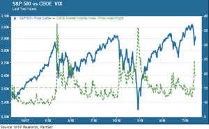
The following chart encapsulates two different ways of looking at risk (when used in the investment definition, the words “risk” and “volatility” are essentially interchangeable). The dotted green line shows the price trend of the CBOE VIX, a widely used proxy for market risk. The solid blue line shows the trajectory of the S&P 500 equity index over the past two years.

So what does this chart show us? The VIX is popularly known as the market’s “fear gauge.” When it spikes up above a price level of 20 or so it generally signifies a sudden pullback in equity prices. The best way to understand the VIX is through a topological analogy of peaks, valleys and mesas. In the chart above you can see a “valley” over on the far left extending through the latter part of 2017 and into the first month of 2018. Those were some of the lowest (i.e. least risk-on) levels ever recorded since the VIX contract launched back in 1990. Then, in between the sharp peaks of early 2018 and the latter three months of the same year, you see a mesa formation – a floor that is still at a noticeably higher altitude than that of the previous year. In 2019 we drive up to an even higher mesa, punctuated by this week’s risk spike.
Just from this part of the picture we see a slow, steady elevation in baseline risk levels. What this is actually saying – the raw material underlying the VIX being S&P 500 stock options – is that traders have been gradually increasing their hedge positions in the market from the low levels of 2017.
An Eight-Lane Sideways Corridor
We fill out the risk picture by analyzing the second element in that chart – the price trend for the S&P 500 itself. If you tune into the financial news on any given day you will usually learn little more than the fact of the market being up or down on that given day. If there has been a decisive directional move for, say, a couple weeks or so then you might hear some chatter about the bulls or the bears running hard. But rarely do the financial media chatterboxes stand back to look at the bigger picture. Here is where the two year view of stocks shown above provides a broader context for volatility.
From the market peak in late January 2018 to the current time, the basic directional trend of the market has been sideways. It peaked at 2872 on January 26, 2018 and closed at 2881 on August 6, 2019 – flat as can be. But the width of this sideways corridor has been wide enough to drive a handful of oversized semi-trailer convoys through. This is thanks to the plethora of pullbacks (the largest of which was the 19.8 percent peak-to-trough event of last fall) that have served to keep directional upside in check.
So what will break the corridor, either to the upside or the downside – and when? Those are questions for which every equity investor would love to have the answer, and none do. However, it is perfectly reasonable to imagine plausible catalysts that could enable the breakout. On the upside, it may be clear evidence of organic growth drivers that would give a renewed tailwind to corporate sales and earnings potential. On the downside, it could be a visible loss of credibility by central banks in their efforts to shore up asset prices with aggressive monetary policy.
As long as neither of these outcomes materializes, it would be reasonable to imagine staying in this wide risk corridor for some time to come, and putting up with the periodic pullbacks that follow a run-up in price appreciation. Meanwhile, it would be nice to see a healthy productivity reading when that figure comes out next week – though we’re not holding our breath.