
Meet Our Team

In the wonderful world of economic analysis we have hard data and soft data. These two things have been at odds with each other for some time, keeping those who try to supply insights and explanations about the data, ourselves included, asking why. We will try to come up with some answers as we delve into this topic today.
Let’s establish some basic definitions. By hard data we mean the numbers associated with macroeconomic performance metrics, the big three of which are arguably growth (GDP), prices for goods and services (inflation), and the availability of jobs (payrolls and the unemployment rate). Soft data, on the other hand, refers to surveys of sentiment and expectations among identifiable cohorts in the economy such as households, small businesses or multinational executives.
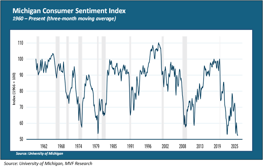
You could say that it’s a question of what they feel (soft data) versus what they do (hard data). Let’s look at one recent data point that has raised some eyebrows among those who follow these things. Here is the University of Michigan consumer sentiment index, with data gathered from households across the country going all the way back to 1960.
The Vibecession in Living Color
The most recent reading for the Michigan sentiment index, reflecting surveys conducted in March, has household vibes at their lowest level ever. Ever, as in lower than the 2020 pandemic. Lower than the great financial crisis of 2008. Lower than the stagflation of 1979 that led to 20 percent interest on car loans. You get the picture – lowest level in the past 66 years. When you hear financial pundit types talking about the so-called vibecession, this is what they are talking about. Now, to be clear, not every sentiment survey is quite as down-in-the-mouth as the Michigan one. According to the Conference Board’s Consumer Confidence Index, sentiment is currently about as bad as it was during the 2020 pandemic, but better than the dark days of 2008. That still gives one pause, though, given the general absence of a pandemic today.
Meanwhile in Hard Data Land
So, far though, the negative vibes are not showing up all that much in the macro hard data reports. Yesterday we got the first quarter GDP numbers, showing growth at a modest but still positive two percent (annualized) for the quarter. Consumer spending, which makes up close to 70 percent of total GDP, grew at 1.6 percent, a bit better than expected. Last week’s retail sales numbers for March also beat expectations, with headline sales up a healthy 1.7 percent. As far as jobs and inflation are concerned, they are not great and are moving in the wrong direction (unemployment and inflation both trending higher, which makes the Fed’s job in managing monetary policy very complicated). But a 3.3 percent consumer price index (CPI) and 4.3 percent unemployment rate are far, far from the most dire figures in either category. Worthy of a vibe-cooling, maybe, but not a vibecession.
There may be a simple explanation, though. Poring through levels of detail in consumer activity provides ample evidence of what economists are calling the K-shaped economy, with the bulk of spending being done by the wealthiest segment of society. To be specific: at present, according to many sources, about half of all consumer spending is coming from the top ten percent of consumers by income level.
Now, presumably when representatives of that top ten percent show up in the soft data consumer surveys, they are likely to be pretty happy with the state of things (at least as pertaining to their own material well-being). But the other 90 percent of households also feature in the surveys, and that’s where the hard-soft gap is likely to be situated. Simply put, their dissatisfaction as reflected in the Michigan survey and its ilk is more than compensated for in the hard numbers by the fact that the bulk of consumer spending is coming from elsewhere. To use a stock market analogy, you could say that the market capitalization of that top ten percent income bracket runs to half of the total market.
There may be more to it than this, and we will leave aside for now the thornier question of how sustainable this K-shaped arrangement is. But in trying to figure out what exactly is going on in this strange moment in which we are living, one has to pay attention to the hard and soft data alike.